How An Impressive UX/UI Can Boost Sales
How an Impressive UX/UI Can Boost Sales
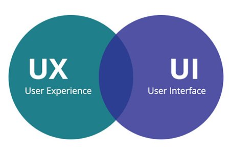
Are you planning to develop a website? You already have one and you want to make it better and boost your sales? In both cases, you must know all about the UX(user experience) and UI (user interface). Both aspects are equally important and they will determine how much a website is successful.
Nowadays, users don’t want to visit old websites that look like they were developed in the 90s. They want modern, fresh and advanced websites that are at the same time increasingly easy to use (improves the user experience).
A good thing is that you can actually do something in order to make your UX and UI impressive and therefore boost your sales. So, what are the main steps?
Don’t make the entire website so filled with details that there is no empty space there. Despite the fact your space is limited, make sure you have a lot of white space. This will have a positive effect on the human eye and make a website better.
Now you know some secrets that professional web-designers use for a decade. All 5 points can help you boost your sales and make your website much better and far more profitable. On the other hand, all of them are very simple to complete.
-
Picture carrousel use
Picture carrousel is probably an unknown term for you. But, so you know what a photo slider is? It is the same thing, just called differently. It is an important addition to a website because it makes certain items, notifications or elements better noticed and more amusing to the users. Make sure you use just a few photos and all of them are paired with visible text. Note: The speed should be low.
-
Simplicity
Even if you have the best website in the world, but it is too complicated to use, you won’t have a lot of users! Make sure you meet the user’s expectations that can be generalized as needs and actions. In simple terms, make sure you make a simple website that provides precisely what and the user wants.
-
Use simple and well-known icons
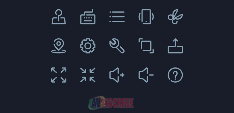
Icons have an important role in making a website better and therefore boost the user experience. Use well-known icons. Users believe they are more interesting and more appealing, which means that chances are higher they will click on them. Don’t use some extraordinary icons that nobody knows what they mean. In addition, label and use text to reveal what an icon is used for. Just adding the icons is confusing.
-
Call to action
Making a website that will make a huge profit won’t be possible unless you install all to action. Now, we all know that it is a simple button that orders, calls, sends, reserves something. A far more important fact is the design of that button. It must be simple, well-designed and it must be modern. Users will probably click on a button that looks modern than on an old one.
Article Comments
Articles Search
Sponsor
There are zero sub-categories in this parent category.
There are zero sub-categories in this parent category.
There are zero sub-categories in this parent category.

