5 Actionable Tips To A Better Product Page

5 Actionable Tips to a Better Product Page
Do you know that B2C e-commerce sales worldwide reached $1.7 trillion last year and is estimated to reach $2.14 trillion next year? How can your eCommerce website get a huge chunk of this glorious pie with all the hundreds and thousands of other eCommerce websites out there in the market? How can your site stand out from the crowd, drive traffic and convert visitors into paying customers?
- Make Your Site is User-friendly
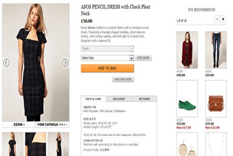
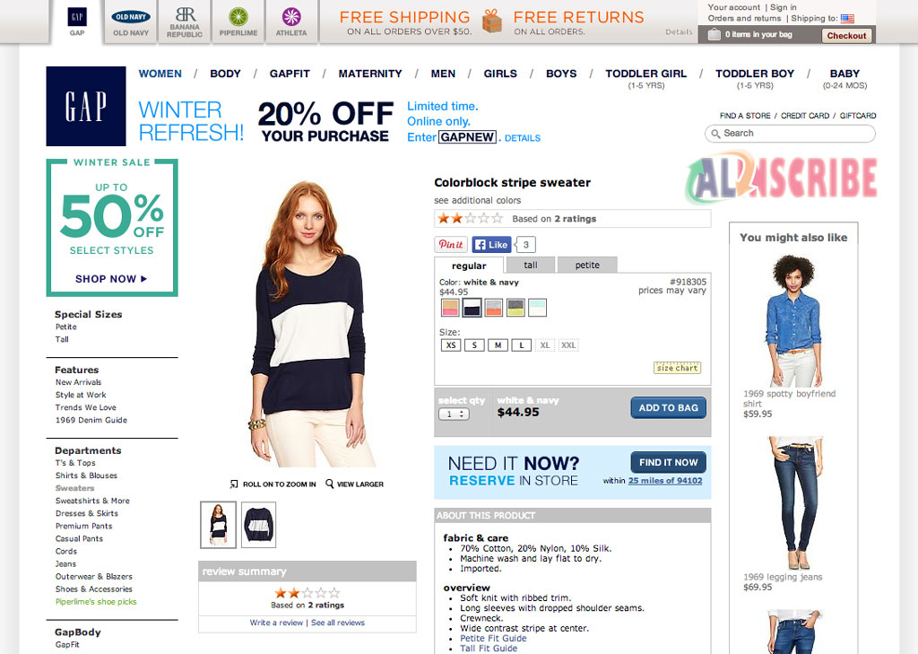
You need a simple and functional user interface design that would allow your visitors to explore the pages of your site with ease. That is the basic requirement of any website, as there is no use of having an SEO-rich content on your site if users find it hard to navigate or browse through your pages. For instance, make sure your products are very visible, properly labeled with description, and are categorized accordingly, if necessary. It is also important that there is a visible button for every page for when you want to go back to the homepage or proceed to checkout.
Your eCommerce site should reflect the overall theme of your business, taking into consideration your target demographic. This would help you formulate a good layout that would result to an enhanced user-friendly experience.

- Include Testimonials of Satisfied Customers
Customer testimonials reflect credibility, and credibility is important to gain your potential customers' trust. People interested in your products want to know how happy your previous customers were with your product. Testimonials may be that much-needed push to turn interested and indecisive browsers into paying customers who would want to try your products out for themselves and see why other people were pleased.
- Go for a Minimalist Approach for Your Landing Page
The average web browser has a very short attention span of only four seconds going over your landing page before deciding whether to move on, or just leave. In this short span of time, how can you grab their attention and keep them hooked?
Remember, some of your website visitors are very busy people thinking about a couple of other things while browsing your site. Some are a very distracted bunch- easily losing their focus when their phone rings, or when their boss suddenly chats them up. It is therefore important that your landing page is simple yet engaging, having only one call-to-action button that would allow your potential customers to proceed to the sales cycle without any distractions.

- Use Auto-suggest
Some of your visitors may just be browsing through, still unsure of what they want to get from your site. It could also be that they already know what they want, but are undecided of what particular design they want to get. For instance, a potential customer might be looking for bags, but still don’t know yet whether to get a red one or a blue one. With auto-suggest, you can help them decide and proceed to buying by giving them an array of related products to choose from based from their keyword.
- Make the Checkout Process Simple
Finally, your potential customer is about to make the purchase. Just one final step, and it's done. But alas! Just as she is about to checkout, she leaves her shopping cart hanging.
This occurrence called shopping cart abandonment is a common problem to eCommerce stores. There are a multitude of reasons as to why it happens- paranoia with regards to website security, limited payment options, exorbitant shipping fees, or simply because there's too much going on in the checkout page.
Ideally, what we want is to keep the checkout process simple. As much as possible, all the information needed to be filled up should be in one page, and confirmation of the order on the second page. Just like shopping in grocery stores- nobody wants long lines and too many questions, right?
Article Comments
Similar Articles
Articles Search
Sponsor
There are zero sub-categories in this parent category.
There are zero sub-categories in this parent category.
There are zero sub-categories in this parent category.


